eyes4you — Comfort, brought into focus.
UI/UX design for a Portuguese contact lens subscription platform. The goal: make reordering feel like nothing at all.
Deliverables
Services
Website UI
Mobile UI
UX Flow
Visual Design System
Animations
UI Design
UX Design
Visual Design
Motion Design
Nobody gets excited about buying contact lenses. You need them, you order them, done. eyes4you wanted to change that. I worked with Escolha Digital over a few months to design a website that gets out of the user's way, looks genuinely good, and doesn't make you feel like you're filing paperwork to reorder something you wear on your eyes every single day.
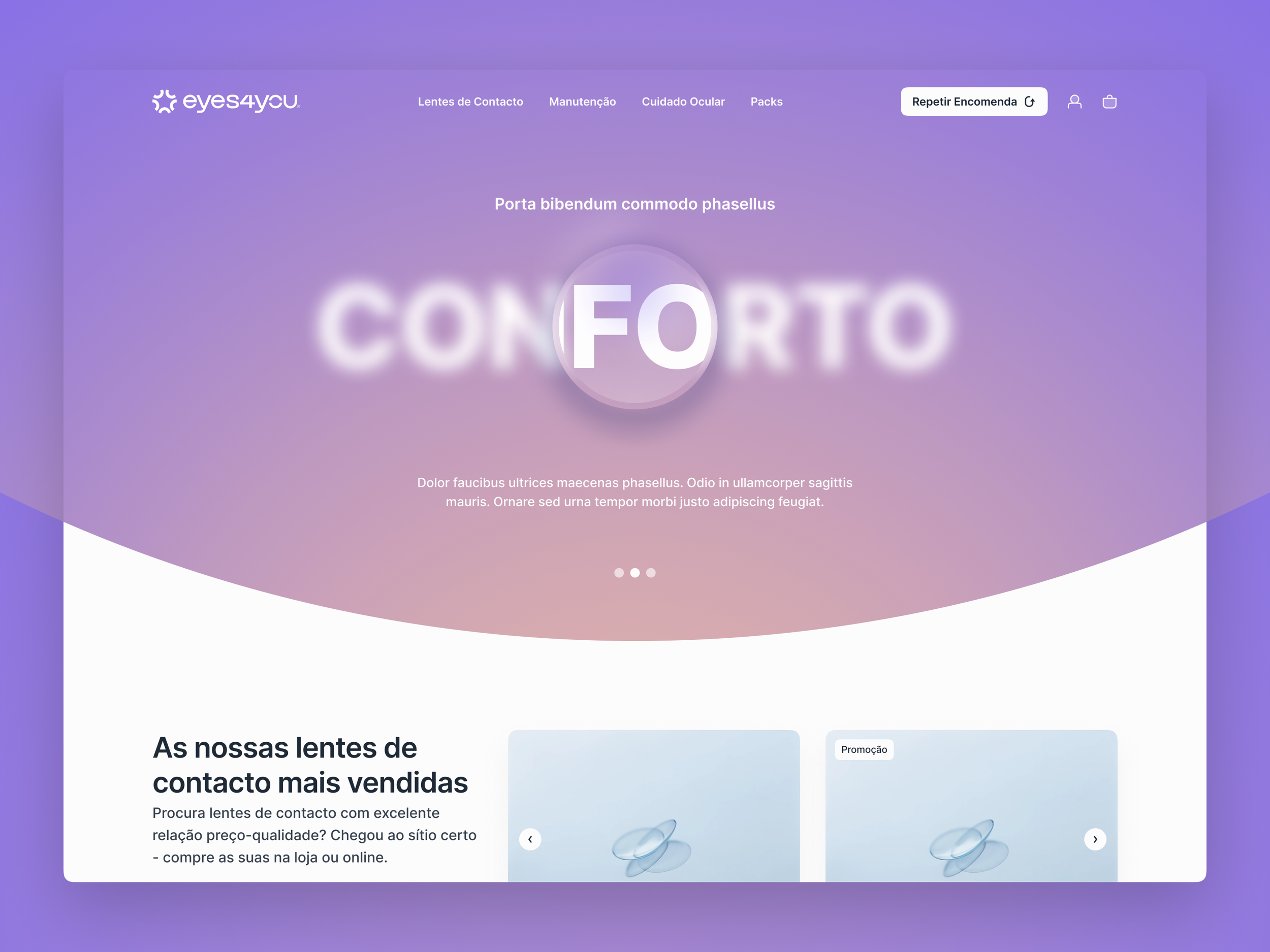
The hero idea.
The big visual moment on the homepage is "CONFORTO" — Portuguese for comfort — in blurred, frosted type. Most of the letters dissolve. Right at the centre, inside a circle, everything snaps sharp. Like a lens settling into focus.
It's one of those ideas that either clicks immediately or it doesn't. I think it clicks. It doesn't need explaining.
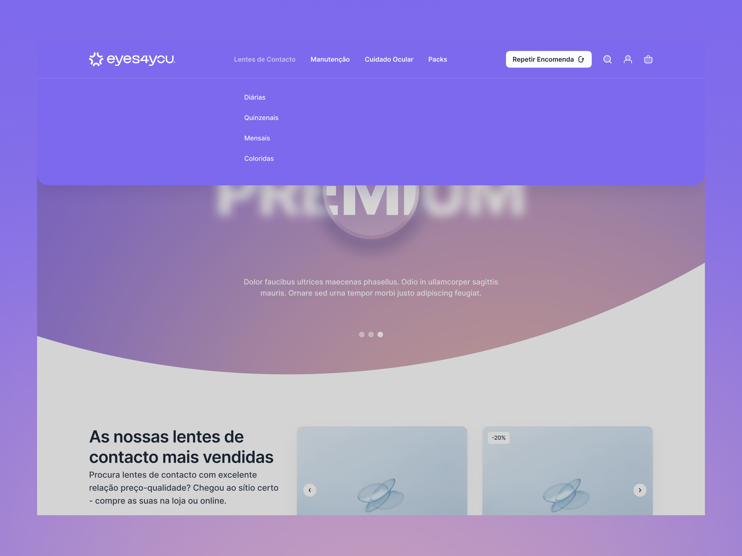
The nav told me everything.
The main CTA in the navigation isn't "Shop." It's "Repetir Encomenda" — Repeat Order. That one label changed a lot of what came after.
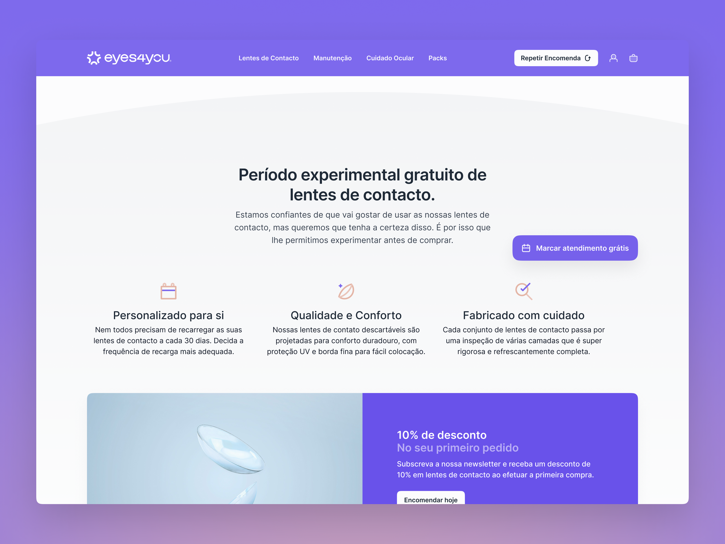
People already using eyes4you don't want to browse. They know their prescription, they just want more lenses. So the UX gets them there without fuss. New users still get a proper path through — free trial, adjustable subscription frequency, a first-order discount — but returning customers aren't made to jump through hoops. You already have their trust. Don't waste it.
The visual side.
Palette goes from full violet at the top down to an almost-white base. Warm enough to feel approachable, not warm enough to look like a spa. Motion is smooth without being slow about it. Cards, space, soft transitions, nothing jarring.
We could've gone clinical with this. White everything, blue accents, stock photos of opticians. We didn't. It still reads as trustworthy — which matters a lot when you're talking about something that sits on someone's cornea — but it has personality. The two things aren't mutually exclusive.
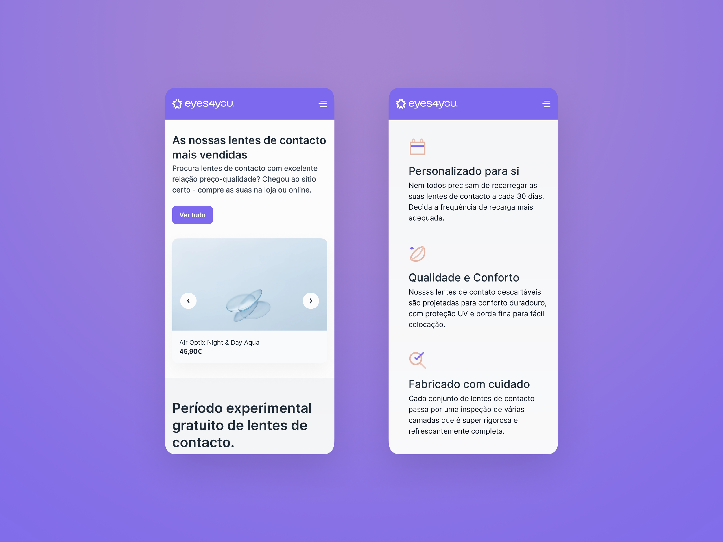
Mobile.
Most people reordering lenses are doing it from their phone, probably while thinking about something else. The mobile screens got the same attention as desktop — same card structure, same hierarchy, same ease. If anything the tighter format made the decisions cleaner.
It's one of those projects where if the mobile feels off, the whole thing feels off.
TexterID
Identity you can verify.
Working on something?
Whether you're launching something new or refreshing what you have, I'd love to hear about it. I take on a limited number of projects
— so the earlier we talk, the better.
Not a forms person either. Just email me