TexterID — Identity you can see.
Logo and brand identity for a verification platform that proves who's sending the text.
Brand Design
Visual Identity
Logo Design
Services
Deliverables
Logotype
Scale Tests
Grid Structure
TexterID verifies the identity behind text messages. Their customers are messaging platforms like Attentive, Sinch, and Klaviyo, companies that need to know who's actually sending what. The brand words were simple: secure, fast, identity.
The logo had to do two things at once. Say "messaging" and say "identity." A chat bubble handles the first part. A fingerprint handles the second. The question was how to put them together without the result feeling like clip art.
The mark.
The concept started with a chat bubble containing a fingerprint pattern and a checkmark. Messaging, identity, verification, all in one shape.
The hard part was the fingerprint. A real fingerprint is organic, asymmetrical, full of fine detail. A logo needs to work at 16 pixels. Those two things fight each other.
Early versions used thin strokes and detailed patterns. They looked good at full size but fell apart at favicon scale, lines blurred together or disappeared entirely. I went through a lot of iterations trying to find the balance between "this reads as a fingerprint" and "this still works on a browser tab."
The solution was to move away from strokes and use shapes and tonal shifts instead. Fewer lines, thicker, built from the same geometric base as the bubble itself. The fingerprint reads without needing fine detail to carry it.


Built on a grid.
The final mark sits on a 48px grid. Every line, every curve, every gap divides cleanly from that base unit. In earlier drafts the lines were placed by eye, scaled and sliced until they looked right. For the final version I rebuilt the whole thing from structure up.
Rulers on, everything snaps. Consistent line margins, consistent spacing between the fingerprint curves and the edge of the bubble. The kind of precision you don't notice unless it's missing, and then you notice it immediately.


Colour.
The palette is built around a deep blue (#0313AF) that reads as trustworthy without defaulting to the navy-and-white that every bank and fintech already uses. From there it steps through five lighter blues up to a near-white (#DCE5FF), giving enough range for the fingerprint tones, UI elements, and backgrounds.
The logo works in full colour, single colour, and reversed. No gradients in the mark itself, just flat shapes that hold up in any context.

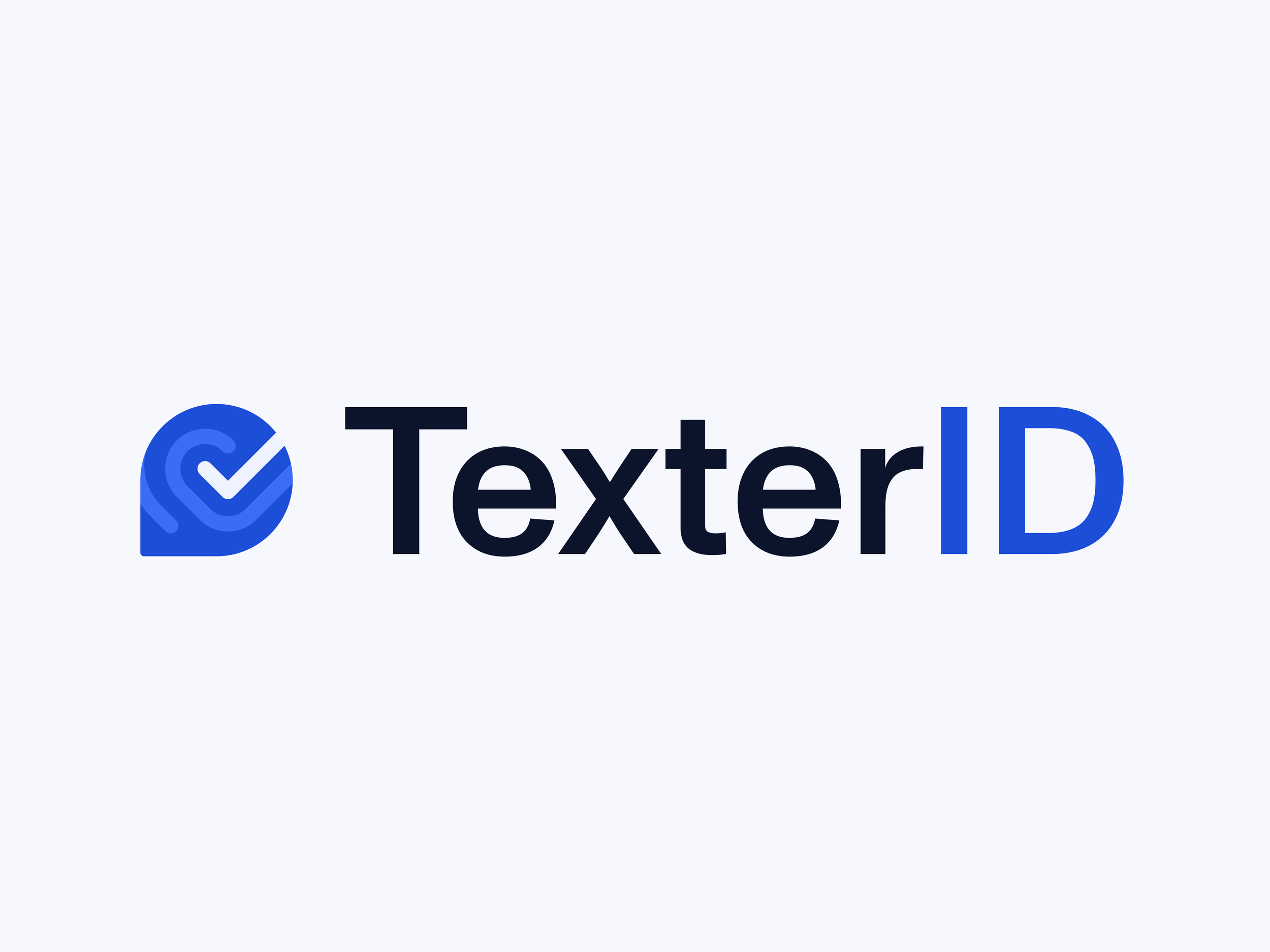
The logotype.
"TexterID" is one word, but it has a natural break. "Texter" is the product. "ID" is the promise. The wordmark treats them differently, the "ID" sits heavier, pulling visual weight to the identity side of the name. Paired with the mark, it reads as one unit without losing the two ideas inside it.
Instance
Visual identity for an AI app builder.

Let's build your brand.
Whether you're launching something new or refreshing what you have, I'd love to hear about it. I take on a limited number of projects
— so the earlier we talk, the better.
Not a forms person either. Just email me