Instance — Build anything. No code needed.
A visual identity for the AI tool that turns ideas into apps, games, and websites — instantly.
Deliverables
Services
Brand Identity
Logo
Colour System
Typography
Brand Guidelines
Brand Design
Visual Identity
Logo Design
Instance lets anyone build apps, games, and websites from a plain-text description. No coding required. You type what you want, it builds it.
The brief was simple to write down and annoying to solve: feel smart but not cold, fast but not throwaway. Something a developer would take seriously and a non-developer wouldn't find off-putting. Those two things don't naturally go together.
Built for speed. Designed to last.
When the product promise is "just describe it and it builds itself," the brand has to make that feel credible before anyone clicks anything. Instance needed to sit next to serious dev tools without looking like it was trying to prove it belonged there.
The direction was clean, restrained, precise. Not warm — more like composed.

The mark.
The logomark came from the concept of instantiation — where an abstract idea in software becomes a real, running thing. The symbol is minimal because it needed to work everywhere: loading screens, favicons, pitch decks, app icons. Minimal things hold up across that kind of range. Fussy ones don't.
No gradients, nothing decorative.
The system.
A logo is one deliverable. A brand identity is a system — and the difference matters. The Instance identity was built so it holds up across interfaces, product screens, and marketing without needing constant decisions made about it. Typography, spacing, colour logic, all of it considered for how it behaves when someone who isn't me is the one using it.
It should work without anyone having to think too hard about it. That's the whole point.
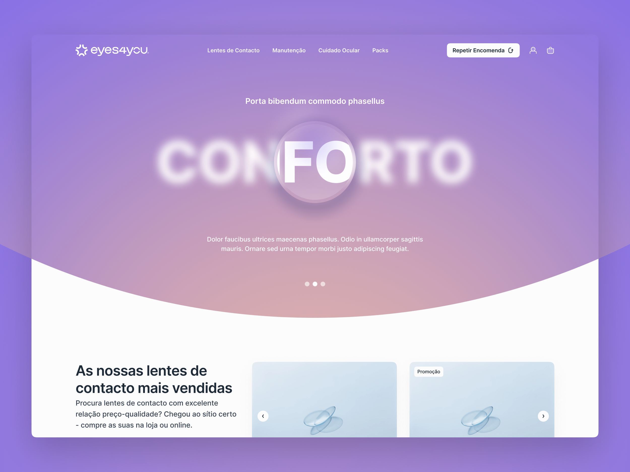
eyes4you
UI/UX for a contact lens platform.
Let's build your brand.
Whether you're launching something new or refreshing what you have, I'd love to hear about it. I take on a limited number of projects
— so the earlier we talk, the better.
Not a forms person either. Just email me