

Colombaia. Four drops a year. Nothing to hide.
Brand identity, a members-only purchase flow and a book for a biodynamic wine estate in Tuscany.
Deliverables
Services
Brand Identity
Landing Page
Purchase Flow
Email System
Social Films
Book
Brand Design
Web Design
Front-end
Motion
Editorial Design
Typography
Colombaia is a biodynamic estate at Colle di Val d’Elsa, in Tuscany. Helena and Dante make small quantities of wine with no chemical intervention and no shortcuts. Colombaia Private is the members’ side of it: four seasonal drops a year, sold to a closed list and nowhere else.
The brief looked like a website. It wasn’t.
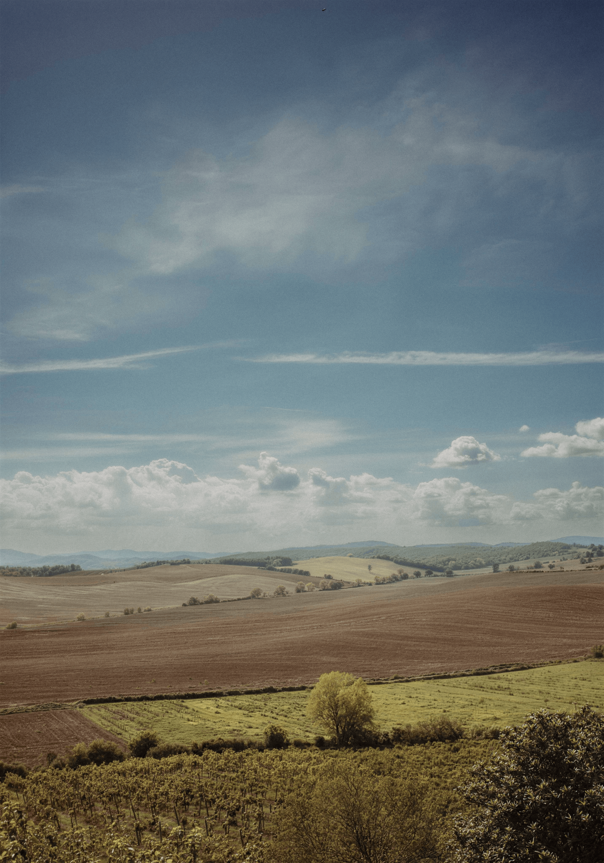
Just the place.
The rule came from Helena, and it turned out to be the most useful constraint on the project: no bottles, no cellar. Just the place.
Every wine brand photographs the same three things. Removing them left landscape, weather and light, which is what the wine is actually made of, and what most wine sites have no room for.
Ffern was the closest reference. Seasonal, scarce, unhurried. But Ffern is cool and green and very British, and copying it would have been the obvious mistake. Colombaia is Tuscan. The palette went warm (cream and a sepia-ink brown) and the type went to Tiempos, which reads like a book rather than a shop.
Restrained, not sparse. There’s a difference.
Then the photographs themselves. They came from the estate, which means they came from phones and old cards, shot across years by people making wine rather than making pictures. Getting them into one set was most of the early work: a single warm pass applied across everything, so a phone frame from 2021 and a camera frame from 2018 could sit on the same page without one of them looking like a mistake.
Several of the ones that mattered most were small. The vineyard shot that became the hero was 1205 × 1728 and had to run full bleed at nearly three thousand pixels across. Higgsfield held the strong edges about half again as crisp as a plain enlargement, at the cost of the fine grain, the right trade at that size, and what let the page open on a photograph instead of a compromise.
It isn't free, and it isn't automatic. The same tool on the book cover, where the source was already large enough, came back with a third of the detail of a plain enlargement: the big edges intact, everything finer wiped smooth, and some invented hatching in the shadows. That one didn't ship.
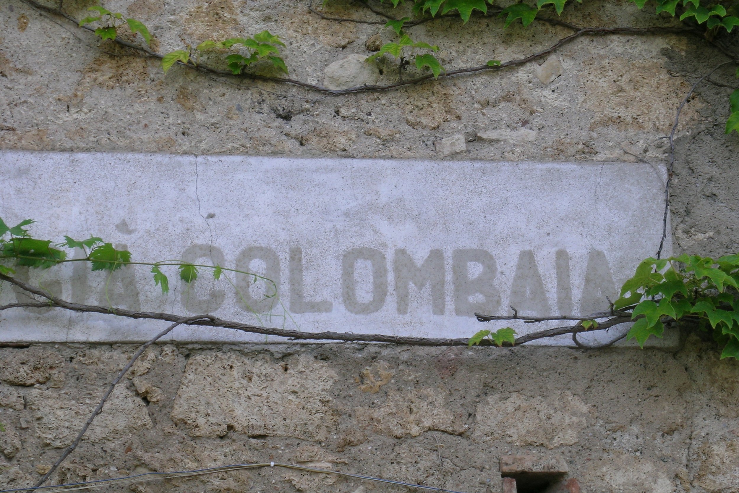
The wall.
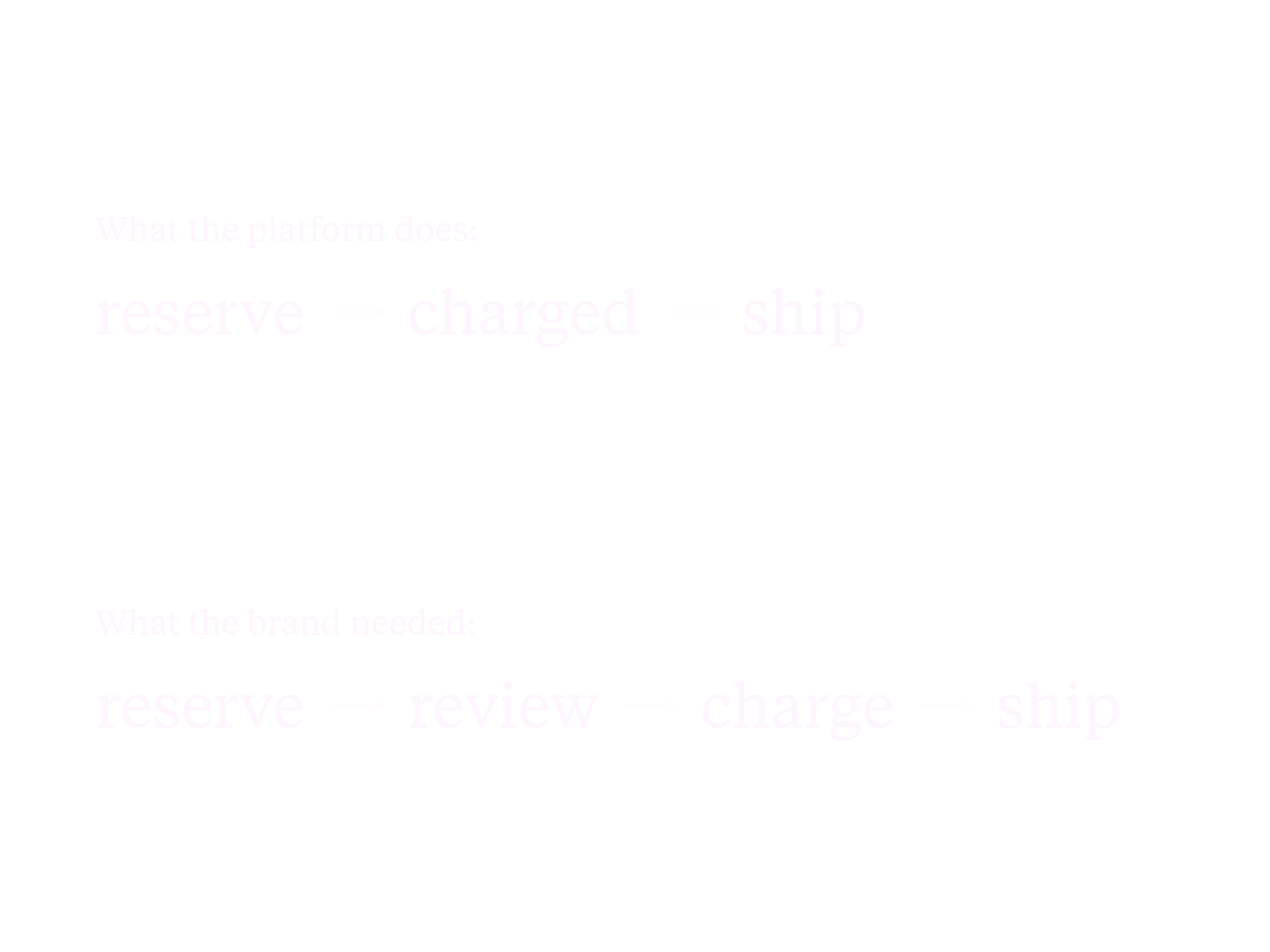
Here’s how Helena wanted to sell wine. Someone reserves. Nothing is charged. She and Dante look at every order themselves. About a week later they decide, and only then does the card get charged.
That review step isn’t an inconvenience in the way of the sale. It is the product. A small estate choosing who gets the wine is the opposite of a shop, and it’s the entire reason the list feels like a list.
Squarespace Commerce cannot do this. Its checkout charges the moment the order is placed. No setting, no workaround, no plugin.
I found this out after building the checkout.
So it got thrown away. Three months before launch, a finished and tested purchase flow was retired, because the alternative was talking Helena out of the one thing that made her brand hers. That trade was never close.
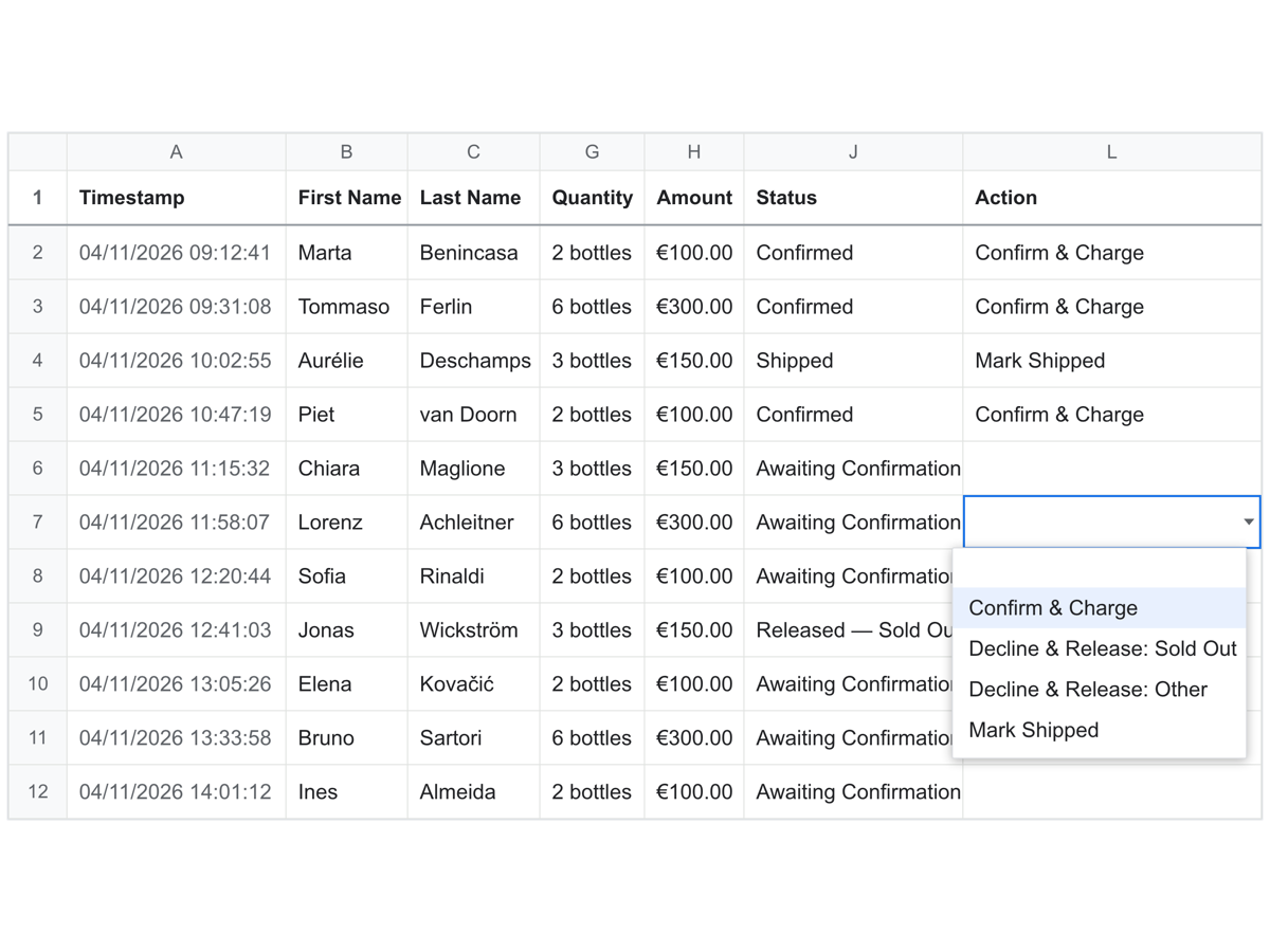
A spreadsheet, on purpose.
What replaced it: Stripe holding an authorisation instead of taking payment, a small backend running on the Google account they already had, and a Google Sheet.
The sheet is the part I’d defend hardest.
Helena and Dante don’t need an admin panel. They need something they already know how to use, at eleven at night, on a phone, in a vineyard. Every order is a row. A dropdown says Confirm & Charge, Decline & Release, or Mark Shipped. Choosing one captures the payment and sends the right email in a single action.
The emails go out from the list they already had, so a confirmation and a decline read as though the same estate wrote them, because it did.
No new software. No new subscriptions. That was Helena’s condition, and it shaped everything underneath.
The most complicated part of this build is invisible, and the interface is a spreadsheet.
Nothing reloads.
This is where the months went.
Squarespace’s checkout is built to do one confident thing when an order completes: take the money and send the customer somewhere. Colombaia needed it to do neither, on a platform with no setting for either.
So it had to be talked out of its own habits. The completion redirect was switched off outright and the return URL dropped, so the platform stops trying to navigate at all. The hook that runs the estate’s own logic was moved onto the completion path itself rather than onto the redirect, which is what stops the page reloading and dropping the order in front of the customer. Several passes to find a version that held, and an unglamorous test: place a reservation and watch whether anything blinks.
Two more things nearly broke it.
Two people could reserve the last bottle at the same moment and both go through, which would have quietly failed the 240-bottle cap. That needed a lock around the stock check, tested at the number rather than assumed.
And a card authorisation expires in seven calendar days, while Helena’s review window was seven working days. Across a weekend those don’t match, and the hold dies before the decision gets made. The fix for that one wasn’t technical. It was putting a countdown in front of the people who had to meet it.
Nine films, nothing added.
The landing page asks for an email and nothing else. The full registration form wants name, address, quantity and card, and it can’t be the first thing anyone meets. The commitment comes later, once there’s a reason for it.
Then nine films for the Mosto drop, cut from the estate’s own footage. Helena’s brief, word for word: “No animation, no effects. Just light, stillness, and the place.” One continuous shot each, one shared grade, the estate’s own sound: cicadas, wind, nothing added.
Nine is more work than it sounds, and most of it was repair rather than assembly. A shot that opened out of focus. Audio that had to be cleaned before it could pass for silence. Three clips rebuilt at higher resolution before they’d hold at full width.
Hardest part was leaving things out.
The book.
Nine months in, Helena sent a manuscript, an actual book, written by her, about what it costs to make wine this way. It arrived as a formatted PDF with no editable text, so the first job wasn’t design, it was archaeology: pulling eighty thousand characters out of a layout that had already been set once, and getting them back without loss. A heading called “The Taste of the Others” had been flattened into body text somewhere in the source’s own history. It’s in the contents list and simply isn’t there on page 41. Nobody had noticed, because the page looks fine.
The cover had one real problem in it. WHO and WINEMAKER? can’t share a point size (three letters against ten), so matching them had to mean matching measure: both lines fitted to exactly the same column width, which makes WHO far larger in points and the two optically equal. That contrast is the design, and it’s what survives at thumbnail size.
What I’d do differently.
I built the Squarespace checkout before stress-testing whether the payment model could survive on it. The limitation was findable earlier. I just didn’t go looking, because the platform was already decided and I assumed that decision had been made on the right grounds. That cost real work.
Smaller, and the same shape: I flagged a missing footnote in the book and moved on. Flagging is not resolving. It sat for eleven days in a document that went to the client twice in the meantime. Anything structurally impossible at the time it’s found needs a task attached to it, not a comment.
The first drop is November 2026, and the book goes to the printer after it.
Live at colombaia.it and colombaiaprivate.com

Working on something?
Whether you're launching something new or refreshing what you have, I'd love to hear about it. I take on a limited number of projects, so the earlier we talk, the better.